
charityBay is an online marketplace that helps users auction preloved goods on the platform. These auctions start at $0.99 and 95% of the profits will go to a nominated charity of the seller's choice. charityBay promotes environmental sustainability by repurposing useful items, which promotes recycling and reduces landfill. After all, one man's trash is another man's treasure. Why not make an impact with your preloved items?
Our challenge was to reduce friction, discover pain points and propose a solution to improve the donation experience on charityBay. In addition to that, the client would also like to remind users that they have a convenient mobile app available.
In this challenge, I led the end-to-end design and collaborated with 3 other talented UX designers (Marcos, Steph and Belinda). As team leader, I was the main point of contact with the stakeholders. I also had to ensure that all deliverables are on track and delegate task to my team members.
In addition to that, I was in charge of creating the style guide and UI components on Figma so that the final design screens are consistent.
The project was delivered on time. In 6 weeks, we delivered our user research and high fidelity designs along with our usability testing results.

To kickstart our project, we had a meeting with the stakeholder for an overview of charityBay but the core business problem were still unclear as what was discussed in the meeting was slightly different from the initial brief.
Through several more clarifications with the stakeholder, we were finally able to agree with our problem statement. It was essential that we agree on the problem statement before going forward and putting more effort into our research and design process.
To dive deeper into the problem, we received 65 responses from the online survey, conducted 8 user interviews and 5 heuristic evaluation with various competitor marketplace that are well known and familiar to current users.
The goals of the research was to:
Here are some of the key insights from our survey:

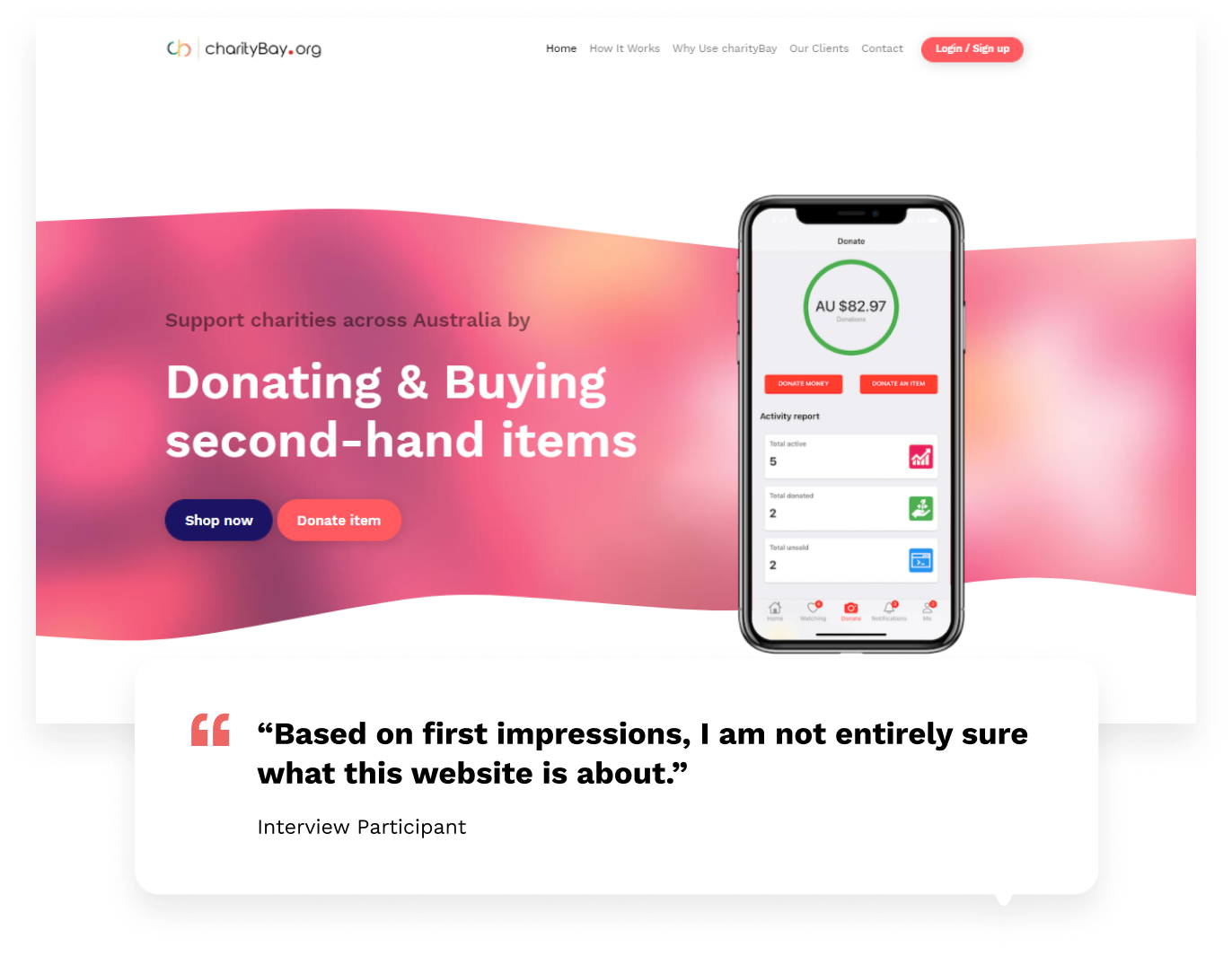
Interview participants were unsure on the core message of the website and what charityBay is offering. They also found it difficult to list an item.


Insights from our interview and survey were grouped into emerging patterns and given priority from left to right. By dot voting, we were able to decide which card that we thought were important to focus on and would have a bigger impact on our problem statement.
We did an extensive interview to provide us with a better understanding of the different target audience which was important for us to anchor our design.

Profile
Kris lives in Adelaide and recently landed a new job at a creative agency in Sydney. He needs to relocate quickly and wants to let go of some of his belongings to simplify his move. He is an outdoorsy person and thinks he will adjust very well to the Sydney lifestyle. He loves camping with mates and surfing when he finds the time. Kris is used to buying and sellling things online but is aware of consumer culture contributing to waste and would like to reduce his impact when he can.
Kris has donated to Salvo’s stores before as he finds it a great way to help out a charity when he doesn’t always have the funds available. He heard about charityBay and thought it would be a great way to help charities, but he was not sure about the process from a quick look on the website.
Goals
Motivations
Pain points

Profile
Chelsea works full time in marketing and rents an apartment with her partner in the inner suburbs of Melbourne. She spends her spare time playing social netball and weekends at the beach. Chelsea likes Facebook marketplace as it’s easy to find listings close by. She also uses this platform to sell unwanted items herself.
Chelsea supports charities she feels a personal or emotional connection to, donating funds through the organisation’s website. She always supports charities that friends or colleagues are fundraising for - whether it’s an event, fun run or donation drive. Chelsea recently discovered charityBay through a friend and thought it was a fantastic concept. Upon visiting the website she successfully donated two items but found the process a bit overwhelming when she had to categorise her item and choose a charity.
Goals
Motivations
Pain points
To better convey the end-to-end experience of our users across various touch-points while making a donation on the platform, we merged both the users current journey as they had similar pain points.

The chart shows the flow stages of the user and allowed the team to organise and evaluate all the information we have gathered through our research. It also allowed us to clearly see the pain points and frustrations of our user in the donation process.
Since there were 4 parts in the donation process, we divided the user flow so that each one of us can manage one section of it. By splitting up the user flow, everyone had their own objectives but can also assist one another at the same time.

We then created a shared Miro board so that we were all able to share ideas and inspirations with each other, while making sure that our own task gets completed.

It didn't take long before the boards were filled with ideas from Crazy8s, sketches and online inspirations.
We then plotted these ideas onto a MVP matrix to determine which to prioritise.

We had a look at IA and thought it would be good to optimise the donor’s experience right from the landing page. Our research indicated that the homepage did not give users indication that charityBay was a marketplace.


Users felt that having different homepages (before and after signing in) was confusing. We created a singular home page that encapsulates the core features of charityBay - a donation-based marketplace.
As I was in charge of the redesigning the homepage, I started off by doing paper sketches of the layout before putting it together on Figma. Sketching helped me visualise the layout and it was quicker to iterate on paper rather than on Figma.

Call-to-action buttons to donate were strategically placed in between the homepage to reinforce the donation and make donating easier for the user.

Step 1 - Title and category
We moved the sign up/login page to the start of the donation process to gain insights as to whether this would improve the flow or cause friction.
From our research we found that the category selection page was one of the main pain points. So we grouped the first few steps into a single screen where users would be able to enter their item title and select a category.
Another call-to-action to download the app was also added on this screen.

Step 2 - Item details
Usability testing participants felt that having to type out a lengthy item description was a pain point. So we broke down the long item description text field into multiple dropdown. These dropdown are tailored to the category selected by the user. There's also an optional description text field which will be populated with details based on the user's answers.
We also added tips and information in the different sections to help donors navigate and understand the steps.

Step 3 - Charity selection
Research revealed users found it overwhelming to choose a charity and had concerns about where their donation would go. Adding a short description about the charity helps the user understand what the charity does with the option to also view their profile page.
We also refined the “Help me choose” quiz
to streamline and give more accurate results as there were thousands of charities listed on the platform.
A sort function were also added so that users can sort the results alphabetically or organisation size.

Step 4 - Summary
In the summary page, users felt disjointed as the last step included delivery and auction details. We moved this information into the item details section, so the final step includes confirming a charity and reviewing the summary.
Once a listing is successfully posted, users will have the option to share them on social media - either their listing or a virtual “badge” to show their support to the charity.

Before starting our usability testing with participants, we conducted our first usability testing with Alex - charityBay's Product Manager to ensure that they were happy with our wireframes and if we were asking the right questions. Key insights from the meeting included:

To save time, we made the decision to iterate designs from our usability feedback based on our wireframe prototype onto high fidelity designs. Further testing is then made with our high fidelity prototype.

Before: Too many products on home page
Users think that there were too many listings on the home page, resulting in the website looking cluttered.
After: Listings reduced on home page
Listings has been simplified and reduced to make the website cleaner with focus on certain categories.

Before: Creating account or logging in at the start of process is redundant
Users expressed that they would feel less inclined to continue with the donation process if they were required to create an account as the first step.
After: Moving account creation / log in to the final step of donation
We decided to keep the sign up / log in process as the final step to allow new users to familiarise themselves with the website.
A notice was added left of the ‘Next’ button on each of the screens to indicate that users would need to create an account in order to post their item.

Before: Difficult to tell sections apart
Users indicated that the page looked very long and it was difficult to differentiate the different steps.
After: Differentiate sections
We broke down each step by boxing each section and using a background colour and grouping the steps accordingly.

Before: Uncertainty on price and shipping/pick up options
Users felt that it was not clear that they could turn on both price (auction and buy-it-now) and shipping/pick up options.
After: Tips added
A tip at the start of each section was added to clarify to users that they could turn on one or both options.

Before: ‘I’m feeling lucky’ shuffle button missed
Users were were not aware that the shuffle button could be clicked again to reveal new charities.
After: Button highlighted and added copy
The shuffle button is highlighted upon clicking and users is prompted to ‘shuffle again’ when this is selected.

Before: Too much to read in item summary
From our observation, users were taking a bit of time to read over the summary information of the listing.
After: Listing preview
A preview of the listing was added to give the users an idea of how the listing would visually look like.

Before: Post ad button not clickable
The ‘Post Ad’ button on the last step of the flow was initially greyed out and not clickable to indicate that users would need to sign up or login before proceeding. They had to do so by clicking on the text beside the Post Ad button.
After: Post ad button leads to login / sign up
To fix this, we made the button clickable and led the users to the sign up / login screen without disrupting the flow. Once logged in, users are directed to the final page which indicates that their ad has been successfully posted.
Thanks for reading my case study! Below is a button to view and interact with our final prototype.
Interact with the final prototype here 👈
Or better still, sit back and watch the video:
Here are some feedback from our high fidelity usability testing:

Users thought that the donation flow was much more intuitive and easier for them to upload a listing.

The team at charityBay was also very happy with our final delivery and are implementing the homepage design as their next sprint. I am currently working closely with the developers from the charityBay and assisting with design handoff.
Positives
Collaborating and including the client in the design process was very beneficial particularly in ideation, validation or feedback. By doing so, we are more likely to obtain buy-in and make them feel involved. After all, we are designing for them. Moving forward, I will definitely try and include the client at every opportunity especially when the client is very engaging, friendly and enthusiastic in getting involved.
Negatives
Leading a design team for the first time, it took me a while to adjust and understand the dynamics of our newly formed group. As a result, there was a delay in the first week in deciding on the problem statement because we couldn't decide on which one to work with. If I was ever team leader again in any other project, I've learnt that it was important to make a call and move on rather than spending too much time dwelling on a particular issue.
Thank you for reading!
Hopefully you enjoyed this case study. If you have any feedback, I’d like to hear from you. Say hello at brianfoong@gmail.com or connect with me on LinkedIn 😉
I’d also like to thank Stephanie, Belinda, Marcos and charityBay for being such great help with delivering this project. They were simply amazing to work with and it was such a joy collaborating with them every step of the way.