
Brief: To design a podcast mobile app that can bring even more utility to the user than a book ever could.
Note: The following case study is part of a design challenge.
Podcasting and audiobook is a growing industry with limitless potential. But how do we bring the same experience of reading a book to an audio-based listening platform?
“If you’re reading, it’s pretty easy to go back and find the point at which you zoned out. It’s not so easy if you’re listening to a recording” | Time Magazine
“Podcasts might be a useful tool to supplement or enrich course-related material, but they are not as effective as text for delivering primary content.” | Taylor & Francis Online
With these pain points in mind, my goal was to create a more joyous and memorable listening experience for podcast listeners who travels to work daily.
To begin my research, I started to look at a few competitors or similar platforms, analysing UI, UX, User flow, IA and key features.


I conducted user interviews with a sample size of 8 participants, who are regular podcast listeners. Some of the key questions asked include:
Key insights from user interviews were placed onto an Affinity Map and grouped into emerging themes. These themes are ranked from lowest to highest priority.

I also mapped the response and thoughts of the user to understand their environment and emotional connection.
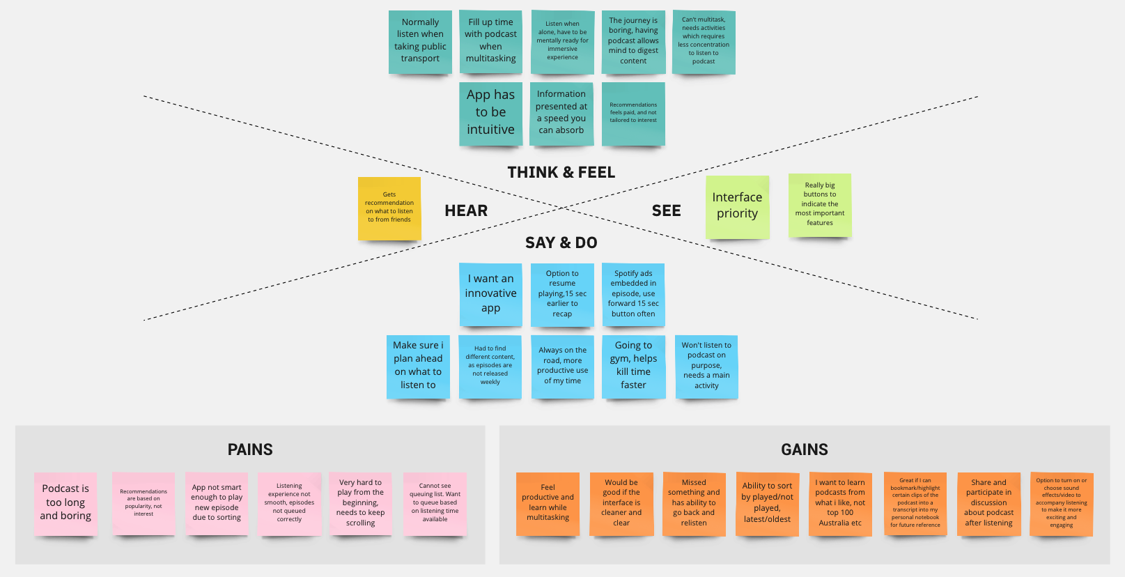
Summarising the research that I’ve conducted, below were the notable insights that stood out:
😩 “I can’t find topics that pique my personal interest and intrigues me”
😢 “I feel lost and confused when using the app, where do i go from here?”
😄 “I love listening to podcast when I’m doing activities that requires less attention!”


Now that I have the user personas, I proceeded to map out the current journey of the listening experience to identify pain points and opportunities.

With the user’s pain points in mind, I started conducting brainwriting sessions, Crazy 8s and storyboarding to generate possible solutions and features to improve the overall user experience.
These ideas were then plotted onto a prioritisation matrix to help narrow down what was absolutely crucial and viable for delivering the MVP.
Ultimately the goal should make content discovery easy for the users.

From the prioritisation matrix, I decided to focus on the onboarding and end-listening experience of the user.
Now that I know which areas to focus on, I proceeded to map out the new user flow for a better overall view of the user journey.

Onboarding — Interest Selection
An onboarding interest selection is not a new idea, but one that is lacking in many existing podcast applications.
When a user first launches his podcast app, they will be greeted with an interest selection screen that will help display curated content that is related to the user’s interest on the home screen.

End-listening — Voting
At the end of each podcast, users will be prompted to make a vote — to like or dislike the podcast that they have listened to. The app will then generate recommendations based on their decision to give them a seamless listening experience.

Onboarding — Interest Selection
Before: Users were unsure why the onboarding interest selection circles were sized differently and would love to have sub-categories.
After: Circles were adjusted to size consistently to avoid confusion, sub-categories to show upon clicking main category.

Interest re-selection button
Before: Users found the filter button on the navigation menu unnecessary as it is something that won’t be adjusted too often.
After: IA has been adjusted to relocate filter button into account settings.

End-listening - Voting
Before: Users think there are too many things to look at on the voting screen and might overlook voting.
After: Autoplay function removed and recommended podcast to only show after voting to display more accurate and relevant content.

Cloudcast’s style guide was developed with the user persona in mind. The orange colours was chosen to reflect the user’s personality — motivated and productive.


Interact with the final prototype here 👈
Inspiration:
The bubbles in the onboarding screen were inspired by the early stages of Apple Music’s onboarding process in 2015:

I found the bubbles fun to interact with and were visually attractive. Hence I adapted a similar approach rather than just letting users select from a list of dropdown topics.
Before: From the hi-fi usability test, users found that better curation of content can be made by adding an additional step upon voting no.
After: A selection of answers is displayed to allow users to specify why they did not enjoy the podcast before displaying podcast based on their answer given.

By letting the users choose the topics they want to listen to at the beginning of their listening experience helps give the user a more personalised journey with the app. Rather than listening to generic recommendations that are not tailored to their interest, users can now listen to podcasts that can relate to.
The voting experience also helps the app learn what the user likes and dislikes, which in return recommends them better title suggestions. This will give the users a seamless listening experience rather than them having to think what to listen to next.
Final usability testing quote from user: “This is such a cool idea! If this podcast app is available to download, I will actually use it”
This project has given me an understanding of the importance of user validated solutions before working on the actual designs. Coming from a graphic design background, often times we start designing without laying the groundwork first — which is researching on what is the most viable, feasible and desirable possible solution for the users?
Another important takeaway from this project is that there can be many solutions to a single problem. The key is to keep reminding myself, who are we designing for?
Thank you for reading!
Hopefully you enjoyed this case study. If you have any feedback, I’d like to hear from you. Say hello at brianfoong@gmail.com or connect with me on LinkedIn 😉